Change can be bad or good
In the case of professional sports teams, usually a drastic change in the name, colors or logo. Such is the case in the NHL. Two teams have changed their logos this year, and one of those teams shortened their name. In the past, a drastic change can sometimes mean good fortunes, and sometimes bad fortunes. Usually when a team gets an updated logo and colors (Tampa Bay Bucs - NFL) they do better. Sometimes they don't - see Phoenix Coyotes.
Anaheim Mighty Ducks are no longer Mighty...they are simply the Anaheim Ducks. I am not too crazy about the logo, but the colors are better and the name is better as well. The purple and teal colors of the past were kind of girlie, and reflected too much on the Disney control. I cannot find a good picture of the new logo (actually, the lack of a logo stuns me) but here is the old one that was simply retarded, and the new wording that is on their jerseys. Also, here is a link to the Design Firm that created it.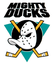
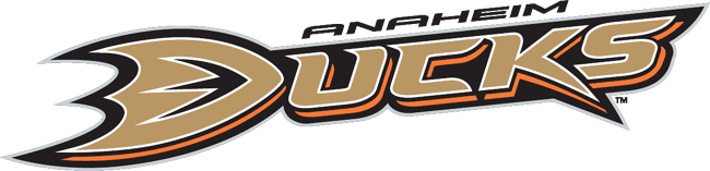
<---OLD NEW--->
The Buffalo Sabres have gone from the Black, White and Red to Blue and Gold. Similar to the colors they were in the 90's, which I really liked. I think this was a good move for them, remind people of when they used to be a powerhouse in the NHL.
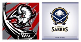 Personally, I really like the Sabres logo now. However they are using a different logo on the jersey... Personally I like the above logo better.
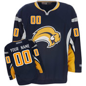
Ducks, could really care less either way. The old one looked like Donald Duck as a serial killer.
Either way, the changes may have helped, since both teams are 3-0-0 so far. But the season is very long, so we will see what happens.
* of course uniform really doesnt directly relate to success on the ice, but if I were in an old Duck jersey, I would feel like an ass and probably play like an ass.
****** UPDATE *****
This fact amazes me! Found on the first link in the comments from McGone:
Interesting note: The Anaheim Mighty Ducks logo is the best selling logo (jerseys, hats, jackets, etc.) since its introduction in 1994
![]()

2 comments:
This guy agrees with you on the old Anaheim logo:
http://www.bushparty.com/htms/hockeylogos.htm
While this guy unearthed some real gems:
http://mirtle.blogspot.com/2006/09/worst-hockey-logos-of-all-time.html
I definitely like the Sabres logo and colors better but the Ducks....hated the old but could have done better with the new. I am not impressed.
Post a Comment